Brand Identity Series, #4: Imagery

A deep dive into the power of photography, graphics, and iconography for the fourth and final piece in our brand identity series.

The more you see, the more you know.”
– Aldous Huxley
A few months ago, Google unveiled a line of iconography for the launch of Google Workplace. This redesign included new icons for Gmail, Google Calendar, Google Drive, and the rest of the former G Suite. While the design community’s response was less than positive, we have to admit both designs are quite consistent. Make no mistake–this consistency is no coincidence.
A side-by-side comparison of G Suite icons (above) and their Google Workplace successors (below).
So, how did Google even come up with either design? And why would Google change it? Why are both sets of designs so consistent? Today, we will explore these questions around visual assets such as photography, graphics, and iconography related to brand identity. For the sake of brevity, we will be referring to the collection as “imagery” for the remainder of this piece.
What Is Imagery?
Most commonly used in literature, imagery refers to the use of figurative language to represent objects, actions, and ideas that appeal to our physical senses. As I write this, a cool breeze is gently blowing the soft, sheer curtains that frame my office window. With that sentence, I hoped to paint a clear picture of what I’m feeling, hearing, and seeing. The purpose of imagery in branding is no different. Similarly, imagery communicates feelings associated with a brand’s core identity. In addition, the medium can vary, including but not limited to print advertisements, digital content, web design, and packaging design.

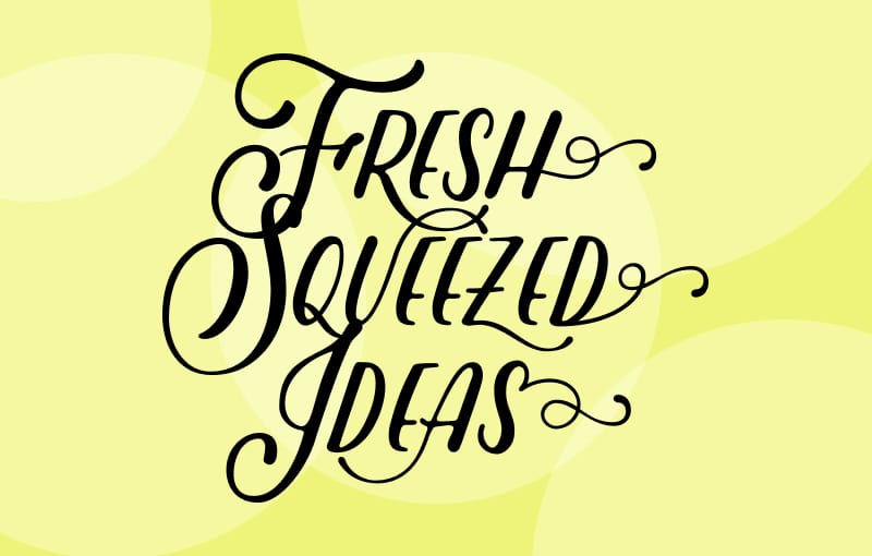
A graphic from The Brand Stand’s Lemon+Aid Create-A-Thon earlier this year.
For example, let’s look at The Brand Stand! We are a boutique creative agency on a mission to serve fresh-squeezed ideas to those looking to build a brand they are proud to stand behind. As a result, the imagery we invoke in our branding, like the droplets of juice, lemon slices, and subtle framing, intends to communicate that very positioning statement.
Why is imagery important?
But first, a game
Let’s play a game of “Who Am I?” Name the brand based on the following statements:
1. I will keep you comfortable.
2. I love outdoor adventures.
3. I identify with Half Dome at Yosemite National Park.
Who am I?
If you guessed The North Face, you are correct! Also, you may have noticed that each line in the riddle relates to some part of North Face’s brand identity. When you were reading each line, what kind of imagery came to mind? Perhaps some snowy treetops? Coat-clad athletes in mountainous landscapes against a bright blue sky? Half Dome itself? And just like that, North Face has us dreaming about the outdoors. BRB–shopping for a new pair of snowshoes.

An ad from The North Face depicting a man running along a rugged, mountainous terrain.
A Visual Species
Over time, evolution has taught us to rely on our vision to communicate with one another. In fact, cave paintings serve as some of the earliest documented proof that our prehistoric ancestors used visuals to communicate with each other.

43,900 year old cave painting found in Indonesia.
Since that first cave drawing, many have studied the significance of visual communication. Most notably is Aldous Huxley, author of Brand New World and The Art of Seeing. He was one of the first to ponder the power of visual storytelling. Struck nearly blind at a very young age, his writings explore the power of sight. He’s famously quoted as saying, “seeing clearly is mostly the result of thinking clearly” and “sensing plus selecting plus perceiving equals seeing.”

In 2019, archaeologists in Indonesia discovered “the oldest pictorial record of storytelling and the earliest figurative artwork in the world,” dating back to nearly 44,000 years ago. According to the report by the New York Times, interpretations vary from a hunting scene to possibly something much more imaginative.
Seeing is Believing
In recent years, studies have shown that we are more likely to remember content when it is visually presented. Officially, this is a concept known as the “Pictorial Superiority Effect.” Therefore, imagery provides clarity around what a brand wants its audience to remember. Without those mountainous landscapes, The North Face runs the risk of missing an opportunity to experience imagery’s many benefits…
What Are The Benefits of Imagery?
When leveraged effectively, imagery has the potential to make your brand work for you. Below, we’ve outlined just a few of the benefits that imagery can conjure for your brand.
Brand Recognition
Reinforcing your brand with imagery can help consumers remember or recognize you. In a previous post about color, we commended Dunkin for its recognizable brand color palette. From the pink and orange icons to the delicious breakfast items, Dunkin’s visual recognition is off the charts.

A wall of Dunkin advertisements.
Brand Loyalty
Psychologically, many people are loyal to brands because of the way it makes them feel. As it happens, imagery is just one method that brands employ to achieve that effect. For instance, Apple’s brand is sleek and modern. By association, those who choose Apple products may feel like they are among the forward-thinking innovators of the world–a status only maintained by buying Apple products. By leveraging equally sleek and modern imagery in its branded materials, from products to marketing, Apple reinforces that brand loyalty.

An ad for Apple’s iPhone X.
Differentiation
Now, consider the difference between these two advertisements for Urban Decay and Bobbi Brown.
At first glance, the two brands sell the same thing: cosmetics. However, the imagery they employ serves to differentiate from one another. In doing so, they are also able to effectively market to their respective target audiences.
International Reach
In the past few years, technology has allowed us to transcend geographic boundaries. For example, an American food brand can advertise to consumers in France with the click of a button. However, we live in a diverse world with over 7,000 known languages. How does that American food brand communicate with the French consumer? We might know a way…

An advertisement for McCafe featuring two hands holding a macaron made to look like a tiny hamburger.
What to consider when choosing imagery?
Now that we’ve covered the definition of imagery, its importance, and the benefits, let’s unpack the strategy. In other words, how does one choose imagery to represent a brand? If we were to create a checklist of all the things required of brand imagery, it might read a little something like this…
Consistency
Across an entire suite of visual assets, it’s important to keep things consistent. In short, disparate designs that look too different have the potential to harm your brand’s reputation. Imagine clicking on an ad for a clothing brand, only to find a completely different look on their website. To the consumer, this inconsistency appears sloppy at best and deceitful at worst. Personally, we’re not so sure we want to give this company our credit card information anymore.

A collection of Blue Apron’s advertising and content marketing examples.
Accuracy
It is so important to choose imagery that accurately represents your brand. To clarify, misalignment can hurt brand recognition and erode the trust between your brand and your audience. For inspiration here, we might suggest returning to our first post in the Brand Identity series on Messaging where we explored target audience and values.
Professionalism
Lastly, professionalism might complete the imagery trifecta. Have you ever decided against making a purchase because the brand’s materials weren’t appealing? Fortunately, strategically designed and intentionally curated imagery can sway purchasing decisions in your favor. Speaking from experience, Tori here falls for beautifully designed packaging at the grocery store more times than she cares to admit.

You win this time, Coffeemate.
Speaking of purchasing decisions, let’s look at some statistics. In 2015, Ehrenberg-Bass Institute of Marketing Science’s report “Shopping Takes Only Seconds…In-Store and Online” found that consumers make a decision to purchase online in 19 seconds, and just 13 seconds for in-store purchases. To make matters even more complicated, consumers generally choose to buy brands that they’re already familiar with. When it comes to branding, we’re fighting an uphill battle against time and habit. So try to choose imagery that describes what you have to offer not just accurately, but quickly.
Why does imagery change?
Aaaand we’ve come full circle. So why did Google change its iconography in 2020? Believe it or not, that wasn’t the first time that Google redesigned its icons. In 2006, Google launched the cloud-based productivity applications we know and love today under the name “Google Apps for Your Domain”. Later, it was renamed “Google Apps for Work,” but the imagery remained more or less the same.

Google Apps icons after the 2016 rebrand.
In 2016, the icons got their first makeover to coincide with the rebrand to “G Suite.” The operative word in both the 2016 and 2020 redesigns being “rebrand”. If you recall, the change in the 2020 icon design coincided with the rollout of Google Workplace. The rebrand was sparked by the change in the way we work as a result of the coronavirus pandemic. In 2016, the catalyst was twofold: an appeal to modern innovation and technological improvements to the products. In either case, Google aimed to communicate a change to its purpose, values, and offerings. Imagery can serve as a powerful tool to communicate change.
They say “a picture is worth a thousand words,” but when business is at stake, we think it might be worth more than that. Every shade, line, and pixel has a place and a purpose. For that reason, imagery has rightfully earned its place as a critical facet of brand identity.
Looking for more on brand identity?
That’s all, folks! This post on imagery marks the fourth of four parts of the brand identity recipe. Did you miss the first three? Might we suggest starting at the beginning with our first piece on Messaging.
Follow Us
Join Us
Subscribe For More Delightful Updates, Like This.
Fresh-squeezed ideas sent straight to your inbox.
Brand Identity Resources We Use
More Freshly-Squeezed